By Emily Maloney

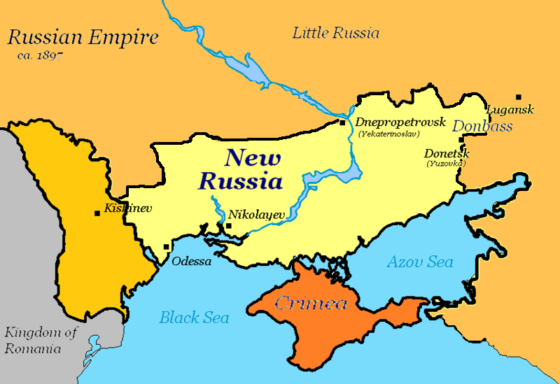
Last fall, in the midst of the high tension between Russia and Ukraine, several major Russian media outlets began propagating maps of Ukraine that label what is currently Eastern Ukraine as “Novorossiya.” Literally meaning “New Russia,” Novorossiya is a historical term that had previously been used by the Russian Empire to describe a very similar geographic area that was under Russian control. Russian President Vladimir Putin carefully calculated a propaganda scheme to defend a possible annexation by claiming this land as culturally and historically—and thus “rightfully”—Russia’s. It is textbook propaganda manipulation, just using a different technique: maps.
Political propaganda maps are actually more common than one would think, and they have been used especially during times of increased international unrest, as in World Wars I and II and the subsequent Cold War. Such maps were intended to impart nationalistic fervor by bending facts and presenting a biased view of locational information.
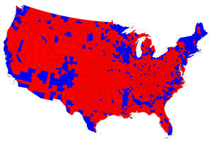
What may be more insidious, though, are current maps that rely on public map illiteracy to promote an agenda. Take this map for example, showing election results at a county level. A cursory skim of the map would lead one to believe that the Republican candidate had won the popular vote in a landslide. In fact, this is a map showing the results from the 2012 presidential election in which Barack Obama was elected to his second term of presidency. This map is misleading because it shows absolutely no information regarding the number of people living in each county. The majority red counties are primarily from rural areas, while the blue counties make up the dense, massively populated urban communities within the United States.
Maps are often seen as exempt from the critical lens applied to other forms of media because they are perceived, incorrectly, as completely objective arbiters of location.
But maps display much more than just location; they tell a story of power, control, and culture. Over time, maps have become an increasingly important visual way for a society to solve a problem or to define itself spatially, creating a worldview that affects national and international decisions.
It is dangerous for maps to be so important in the political and social sphere because maps lie. It is fundamentally impossible to show a three-dimensional, spherical object—the globe—on a two-dimensional surface without sacrificing accuracy of some sort, whether it is area, direction, shape, or distance.
Perhaps the most publicized instance of an inaccurate map is the Mercator projection, first developed in the 16th century and used by European explorers. The Mercator projection maintains the integrity of direction between two places, obviously a trait necessary for navigational purposes. However, the projection has increasing distortion in the size of continents the further away from the Equator they are. In Mercator maps, Greenland is about the same size as the continent of Africa, when in reality Africa is roughly 14.5 times the size of Greenland. The projection exaggerates the size of European and North American nations to the detriment of developing nations in places such as South America and Africa. The misrepresentation of the sizes of countries can reinforce negative stereotypes held about third world countries because they are thought to be smaller, and thus less significant than their Western counterparts.
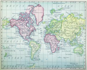
Although this issue is well-known enough to have been featured on the 2000’s political drama “The West Wing,” the Mercator map still often hangs on elementary school classroom walls and is featured inside social studies’ textbooks across America, exposing children to this incorrect image of the world well before they are ever instructed on the various types of map projections.
However, the Mercator map is certainly not useless. In fact, Google Maps uses a variation of the Mercator projection because of its amazing directional accuracy. The issue with maps might not truly be that the maps lie; it is that map projections are used for the wrong purposes, and that people do not have enough map literacy to determine when they are being misled.
Even the way hemispheres are framed tells a story of cartographic bias.
There is no scientific reason people should orient themselves believing that the North Pole is the “top” of the Earth, especially now that a greater understanding of outer space has shown that there is no true up or down regarding the globe and space. The reason practically every map follows the North/South orientation is due to the top-heavy weight of developed nations in the Northern Hemisphere. All of North America, Central America, Continental Europe, and the vast majority of Asia make up the bulk of what is known as the Northern Hemisphere. These countries have consistently controlled the world economy, represented the global knowledge base, and regulated the political discourse for most of modern human history. Therefore, the majority of map development originated in these areas; why would the mapmaker put his or her own country on the bottom of the map?
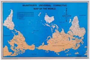
What if the standard map of the world had Australia at the top, flipping the Northern and Southern Hemispheres? One Australian cartographer grew annoyed with the typical orientation of the world map and made one of his own, calling it “McArthur’s Universal Corrective Map of the World.” Glancing at this map is disconcerting—it goes against the spatial relationship people have with the globe.
Maps are subject to the same pitfall every other form of media struggles with: they can only tell one side of a story. Because people and cultures are so tightly intertwined with the location they occupy on Earth, maps indicate political and economic status in addition to depicting how cultures are viewed in a global context. Map design choices can have a long-lasting effect on the public’s perception of the different regions of the globe, as can be seen by this North-South orientation bias.
Putin’s “New Russia” maps are just one example of the trend of purposefully creating misleading maps to manipulate the public using this psychological power. Unfortunately, it appears to be working fairly well as these Novorossiya maps are still circling the web at an alarming rate. We will have to wait and see if reality ever reflects Putin’s version of Russia’s boundaries.